How Spreadsheets Can be Used in an Educational Setting
Microsoft Excel and Google Spreadsheets are two tools that many teacher rarely include in their lessons, although in joining the professional community/ workforce these skills were the ones I use most often. Here are four ideas for language teachers on how to include Microsoft Excel or Google Spreadsheets into their lessons.
|
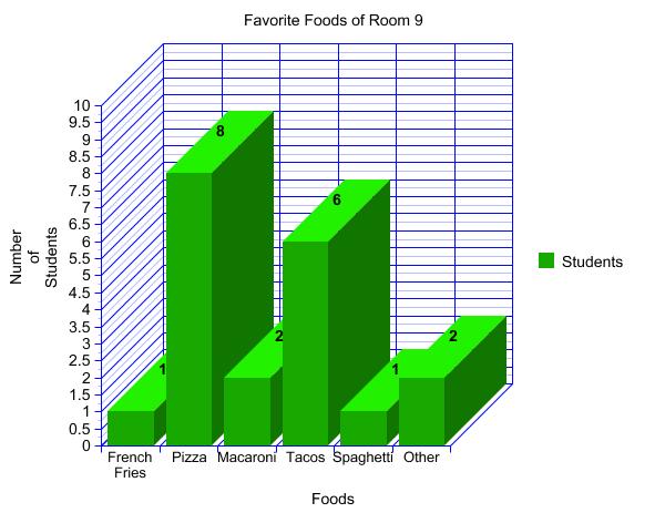
Creating Graphs Have students collect data from each other in the target language, enter that data into Google Spreadsheets, create a chart or graph, and present their finding to the class in the target language. Each student can research a different topic so the class can learn more about each other. To the left is an example of a graph of showing a classes favorite foods. ABC Excel has many ideas that students can use if they can not think of anything. |
|
Google Forms for taking Surveys For Deaf Awareness Day, or awareness day of any minority culture, have the students create and send out a Google Form surveying their school, their co-workers or whoever about their knowledge of deaf language and culture. Then have them create graphs or charts and present them to the public, spreading awareness. |
|
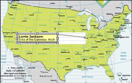
Interactive Maps Students can use Microsoft Excel to create an interactive map that shows where in the US most deaf people live. They can then make inferences as to why deaf population is concentrated in states with bigger cities adding to their growing comprehension of Deaf culture. |
|
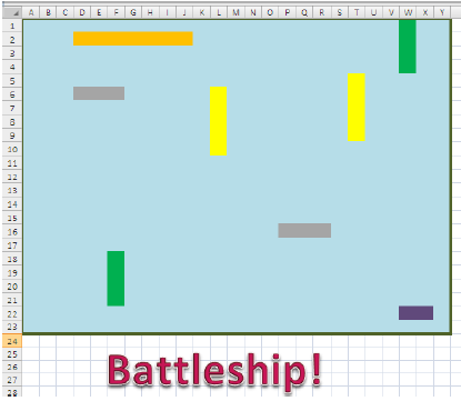
Play Games: Battleship Students can use Microsoft Excel to play battleship in the target language, practicing their letters and numbers while learning about how to use the program. |
|
Excel Mapping Activity - Deaf Population Centers
Description
In this activity students will use online resources to research the deaf population in each state. As a class we will come back together and insert our data into a Microsoft Excel Spreadsheet.
Goals and Concepts
Students will learn how to use Microsoft excel to create visual graphics demonstrating complex ideas. After the graphic is created students will be able to visually see the demographics of where deaf people tend to migrate. By using the spreadsheet to display the data visually I want students to recognize that there are a higher population of deaf people in states with bigger cities, I then want them to make inferences as to why. The students should be able to think critically to come up with ideas related to the culture of the deaf as to why deaf people migrate to bigger cities.
Description of Data
Students will break into groups and use the internet to research the population of deaf people in a few states. Then we will come back together as a class and insert our data into the columns labeled "States" and "Deaf Population". The States column with include the two letter abbreviation of the state, and the Deaf Population column will include the percent of the population that is deaf.
Below is a working example of the spreadsheet and graphic. Note that the data is made up and only shown as an example.
Go ahead and play with the numbers to watch the color of the map change. Green=less deaf population Red=more
